Nodes and links. Links and nodes.
Long long ago, when the total number of cases across India were still in the hundreds, we had a feature called “Cluster map”. But as the cases grew, we dropped the feature. For two reasons - one, the states stopped publishing the contact tracing info, two, the data points to visualize were so many that the browsers crashed. This post is in the fond memory of all those crashed browsers ( ཀ͝ ∧ ཀ͝ )
LoL, not really, this one is about how we re-ran the cluster viz for KA, some general observations derived using this viz, usecases and technical limitations of this form of vizualisation.
The process
So to start off, we took all of KA data and our good volunteer Vikram did a nice cleanup of this data. This cleanup includes correcting the format of data and adding contracted from field for every row that has this info (this info as of now is part of the notes in KA bulletins). Once he was done with the cleanup, we took the data and prepared a json out of it - the one that we could feed to the d3 force layout graph. There are lots of variants of this graph. You can check d3 out here. This JS library is quite a mature library. Yet, any viz that invovles so many data points is bound to cause issues. D3 force layout has variants which use canvas instead of svg to boost performance. Anyhow, without getting too technical, d3 force layout is what we used.
Generation of the json isn’t a difficult thing to do. We took the sheet, used python to pull it and did some small amount of coding to get the basic version up. But the fact is, just showing nodes and links makes little sense. Unless you are able to look at more than one aspect, or atleast are able to show how the clusters progressed, it doesn’t add much value. So yes, we ended up writing a bit more to make all this available.
The following are some of the observations on the KA data that we visualized. These are based on the dates when the cases were announced. None of these are some profound analysis or anything.
As of July 9th, the number of clusters with size greater than 10 is 113.
Out of 113 clusters, 8 have size greater than 50.
Out of these 8 clusters, 2 have size greater than 100.
Cluster with largest number of patients has a size of 242.
Inter-district cluster spead across 3 months:
There are quite a few clusters from KA data that have multiple districts invovled. Here’s one that is spread across 4 districts and has seen cases across 3 months. This started with a case in Mysuru on 26th March and continued to have cases reported in June. Thankfully there have been no new cases traced to this cluster in July. An inter-district cluster is not a good sign. If these districts are the districts where the cases were identified, it means that the spread happened across districts due to possible inter-district travel.
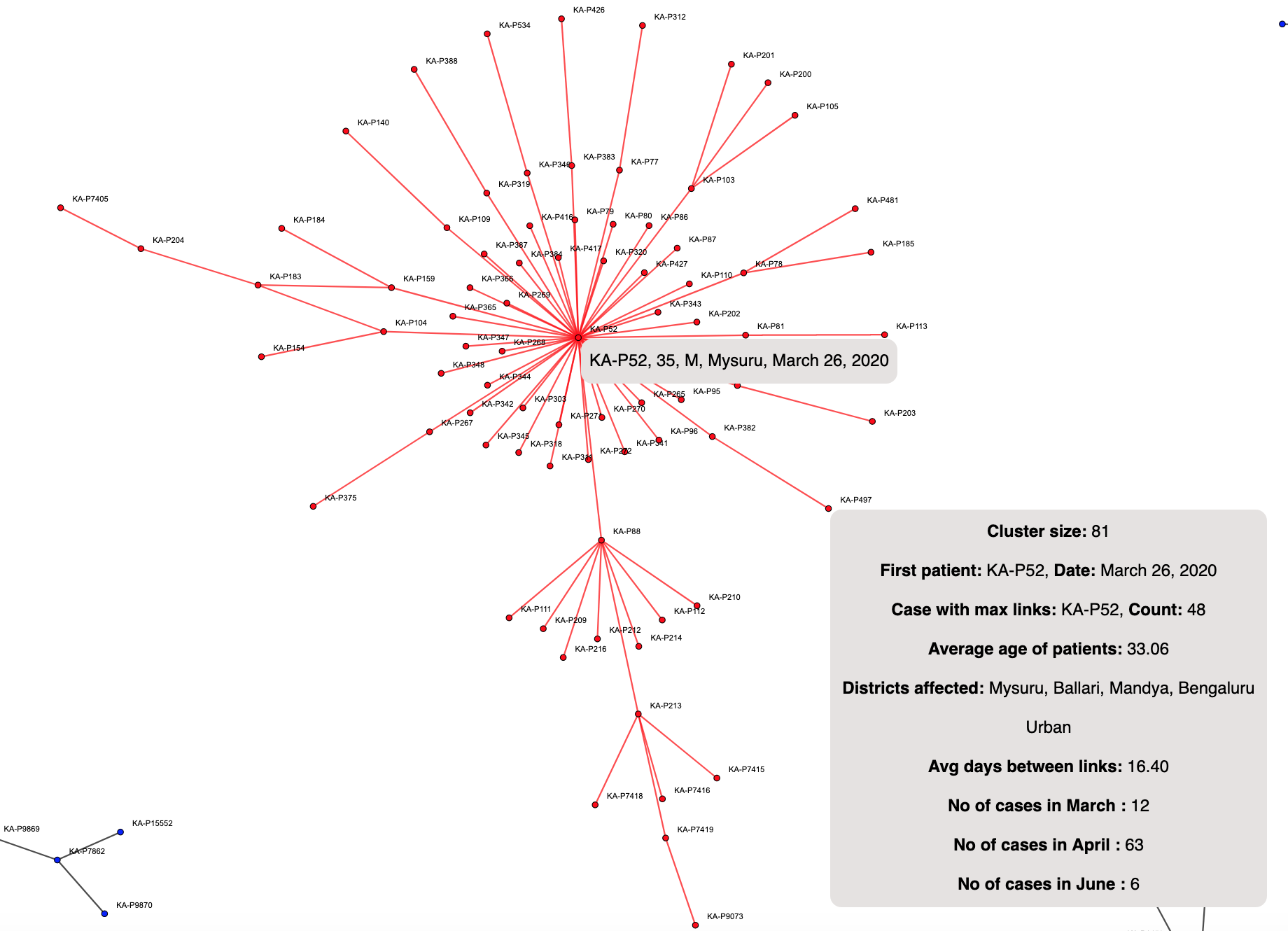 Note that the number of days between each link is around 16 days. Now this means if Node A is connected to Node B, the average difference between them being reported is 16 days. This is quite a high value. In layman terms, the contact was identified, or turned positive after 2 weeks!
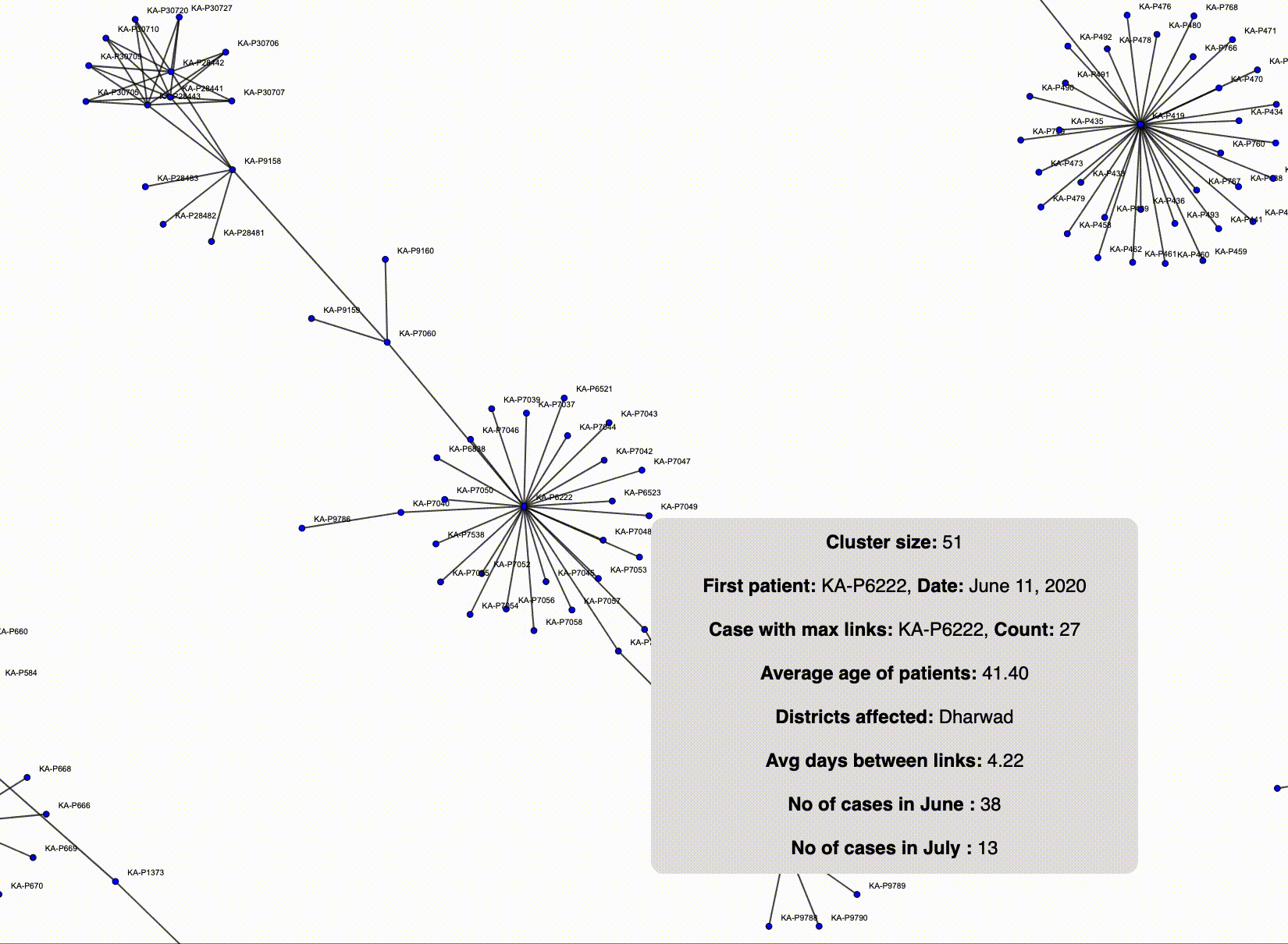
Intra-district cluster spread across 2 months (An animation of the spread):
This one is an animation of how the sequence of cases got reported in this cluster. The cluster starts off in June and continues into July with the latest case being reported on 9th July. Here the average link length (number of days between contacts being reported positive) is around 4 days. This indicates a quick identification/reporting of contacts. All the cases in this cluster belong to the Dharwad district. This is definitely better than a cluster that is spread across multiple districts. Note that this has 51 cases linked in a span of around 30 days.
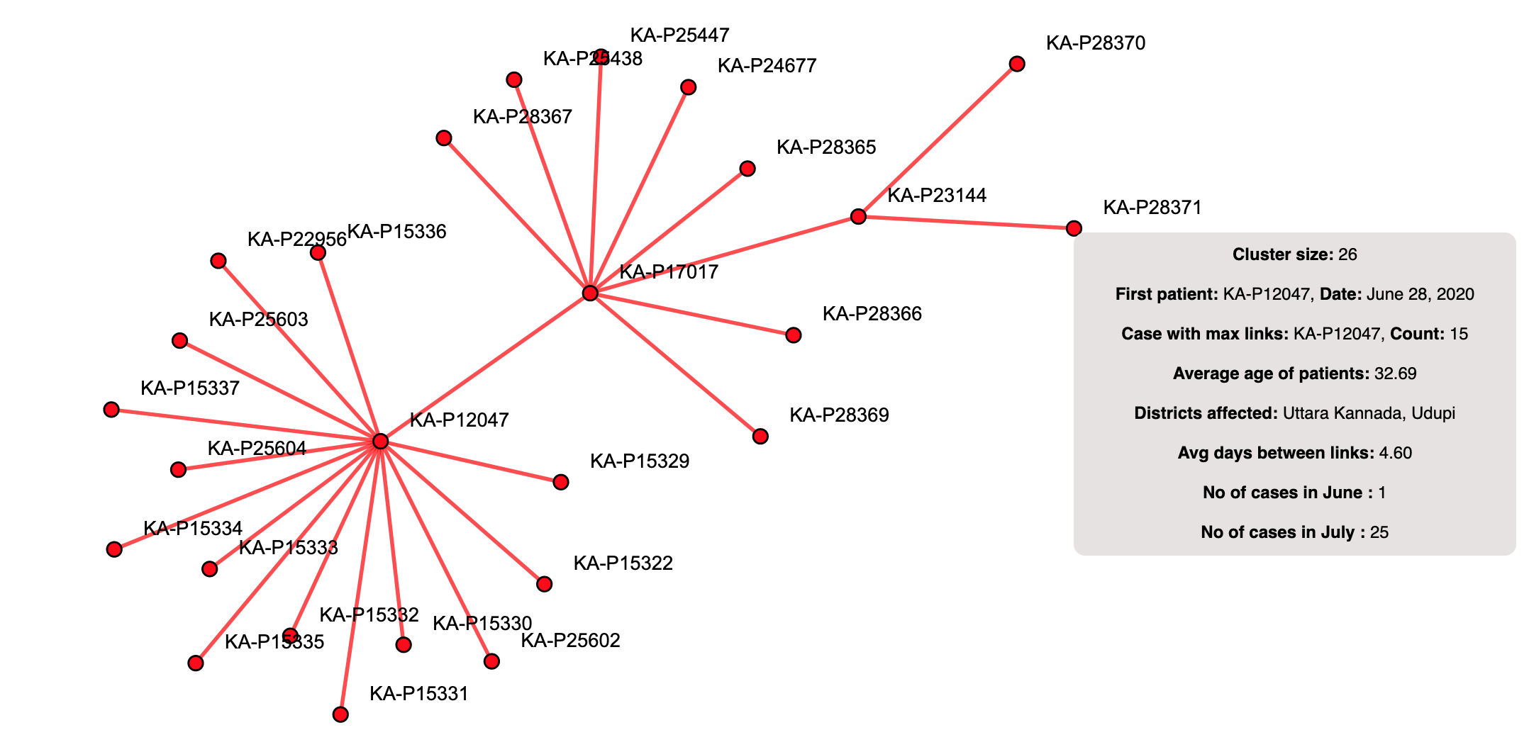
A cluster from the month of July:
Majority of the cases in this cluster were reported in the month of July. Since this cluster is relatively new (first case on 28th June), the link length is quite less. This cluster has two districts invovled. Since the first case was reported on 28th June, this could indicate an inter-district travel. The need for self isolation after travel is evident when you see inter-district spreads.
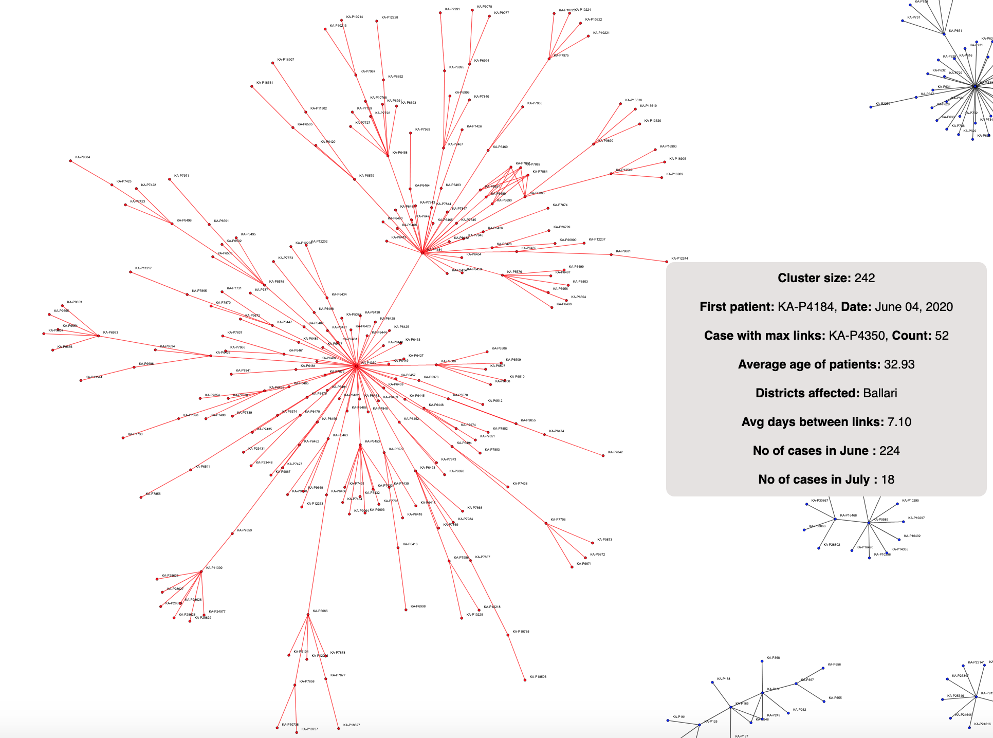
A mega cluster!:
Now this cluster is truly a behemoth! Based completely in the Ballari district, with a total of 242 patients (latest being 6 cases reported on 8th July), this cluster has kept growing. July has seen a total of 18 cases till now. And hopefully this is the last we will see of this cluster! One of the nodes has a total of 52 connected nodes, meaning, one of the patients was found linked to 52 other patients. This connection alone is greater than 107 other clusters that have size greater than 10. There are only 6 more clusters which have size greater than 52 (one of them is the cluster to which this patient belongs). Note that this is also a testament to the untiring work of those on the ground tracing contacts of infected people and reporting it. A cluster of size 242 wouldn’t have been caught had this amazing work not been done!
 .
.
The important question: are these any useful? What are the usecases?
My personal view about the cluster viz is that they make for a very visible, unmistakable representation about how a spread happens or how easy it is for others to get infected. However, there are technical limitations associated with a force layout. After a certain number of nodes, the browsers give up. Not to mention the poor performance of the viz on mobile devices! Now when one tries to visualize the data across the states/districts these might not be good. But what if you were to visualize the data at ward levels? If you were to identify inter-ward clusters, it would mean the containment stratergies did not work as intended? What if you were to go one level lower and do street level clusters? Would it mean within containment zones you saw increased spread (possibly due to increased movement)? How about village level clusters? Inter-village cluster would signify people moving from one village to another, highlighting a need for better enforcement of movement restrictions? There are of course other dimensions like the days between links, the type of link (relatives/friends/co-workers) which can add more visibility to the spread as well. These could act as crucial indicators to what went wrong, allowing for future prevention of spread across geographies. Or even to limit the current spread. These can also act as efficent tools to show the general public how someone can get infected and can end up infecting a large number of people if they aren’t careful.
Parting notes
Cluster viz or no cluster viz, the reality remains the same. The way to reduce the spread is to take safety precautions and be mindful that we can end up being vectors of the disease. These are strange times for all of us. The best we can do is to be aware of the risks and mitigate them, and of course, hope for a better tomorrow.
Until we write again,
Stay safe!
Bee.